I'm back! My dissertation is defended, deposited, and done. I'm a PhD!
In other news, I've got a couple of pictures which nicely illustrate how lighting can totally change what we call a colour's saturation:
This is the exact same outfit, just in two different lights.The yellow, indoor light really highlights the green qualities of the turquoise cardigan, and the cool, blueish natural evening light makes all the blue clothes look more similar in hue. The colours in bright white light are more like indigo (skirt), azure (button down), and turquoise (cardigan). They're all blues, but very different blues.
More on colour in the next segment about colour schemes.
Monday, March 11, 2013
Thursday, February 14, 2013
Wednesday, February 6, 2013
How to Talk about Colour
This is the third post in my series about a personal discovery I recently made about colour. This isn't new information, but it's new to me, and I'm excited about it. I’ve talked about the traditional colour wheel, and the “real” colour wheel already, so today I’ll address what other components of colour are important. Next time, I’ll cover which colours work best together. Also, I'm Canadian, and I spell colour with a U. Deal with it.
The colours I’ve been showing you in these painted swatches are very bright, but most of the colours we live with on a day to day basis are much less concentrated. Bright blue walls would be too intense to live with. Primary yellow furniture would look cartoonish. Our living room has blue walls and yellow couches, but not like the blue and yellow you see in the colour wheel above. Both the furniture and walls are tones. Here's a bit of vocabulary to clear up what I mean:
Hue: a pure colour like cyan or orange.
Tint: a hue plus white
Shade: a hue plus black
Tone: a hue plus grey
We use hues the least frequently because they are so jarring. Unless you live in the tropics, the colours you see most days are probably mostly tones with a few tints and shades. There are a few other ways to describe how colours change.
Chromaticity describes how pure a colour is in relation to grey. As we add more and more grey to a colour, it becomes less pure.
Value describes how light or dark a colour is.
Colours can vary in both value and chromaticity. Tints, shades, and tones don't describe how colours vary in enough detail. The blue tone of out living room walls, for instance, has a low degree of chromaticity which means that the walls are a little bit grey. The colour also has a light value; it is more light than dark. So our walls are blue (hue), but also a bit grey (chromaticity) and rather light (value). Simply calling our walls a tone of blue does not explain in enough detail what colour they actually are.
Saturation is a third way in which colours vary, but it is very subjective, and not often used. Saturation describes how pure a colour is, but not in relation to grey. Imagine a very thick glob of paint – it would be totally saturated. A thin layer of paint, though, would have a low level of saturation. You can also see how saturation would change depending on the lighting. At night, our walls will not look very saturated; they will look more dull. During the day, when there is a lot of natural light, our walls will look more saturated: brighter and more intense. The same exact colour can vary in saturation depending on the context. That's why we get pain chips before painting - to see what they look like in our home and at different times.
The three most important ways that colours vary are according to
(a) Hue
(b) Value
(c) Chroma
You can see how hues change around the circle; a new wedge is a new hue. Value changes along the diameter of the circle, getting lighter toward the center and darker toward the outer edge. Chroma varies up and down the cylinder so that at the bottom of the cylinder we have very grey colours and at the top of the cylinder the colours are not grey at all. Now you understand how colours vary. It's not just blue and yellow, but light and dark, and grey and pure. An important question remains, though. Which colours work well together? I’ll cover that and more next time.
Labels:
chroma,
colour,
colour theory,
colour wheel,
hue,
saturation,
shade,
tint,
tone,
value
Thursday, January 31, 2013
The Real Primaries
This is the second post in my series about a personal discovery I recently made about colours. This isn't new information, but it's new to me, and I'm excited about it. Today, I'll talk about the "real" colour wheel and what it looks like. Last time I talked about the traditional colour wheel, and as the days go by, I'll address what other components of colour are important, and which colours work best together. Also, I'm Canadian, and I spell colour with a U. Deal with it.
Last time, I talked about what we have learned to be primary colours, and how they’re not really primary because we can’t create all the colours of the rainbow with them. I also mentioned that your printer can print all the colours of the rainbow with only cyan, magenta, and yellow, so we can consider those three to be primary colours. This is the “real” colour wheel with yellow, magenta, and teal as primary colours. Notice that blue and yellow sit opposite each other.
The subtractive approach (right) combines paint or ink instead of light. A white background reflects all light, and adding pigment "subtracts" some of the light waves being reflected back to us. The primary colours are the brightest pigments that only absorb one kind of light and reflect the other two. We’ve seen that cyan reflects blue and green lights, magenta reflects blue and red lights, and yellow reflects green and red lights. That’s why cyan, magenta, and yellow are the three primary colours in the subtractive approach.
With objects like clothes, food, and living room walls, using a subtractive approach makes the most sense because the colours are made of pigment (like paint or ink) rather than light.
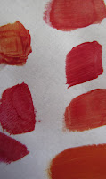
I had a hard time believing that yellow and magenta mixed together would make red. But seeing is believing! Here are some swatches I made by mixing different amounts of yellow and magenta paints. There are warmer reds with more yellow and cooler reds with more magenta. For the most part, though, these colours look like red to me.
All the colour watches I have painted and posted here are made using exclusively cyan, magenta, and yellow paints. The blues you see in my colour wheels here are made by mixing only magenta and cyan.
So to make purple, we have to mix 3 parts magenta with one part cyan. You can play with this formula to create many different purples, as illustrated by my swatches here. Notice that none of them are muddy or grey. That's because I'm actually using primary, not secondary colours.
The problem with mixing red and blue is that you're actually mixing all the primaries together.
Red = magenta + yellow
Blue = magenta + cyan
Red + Blue = magenta + cyan + yellow
This makes for a muddy mix.
Most of the colours we encounter in daily life are not quite so bright as the swatches I've painted here. So where on the colour wheel do they fit? More on that next time.
Last time, I talked about what we have learned to be primary colours, and how they’re not really primary because we can’t create all the colours of the rainbow with them. I also mentioned that your printer can print all the colours of the rainbow with only cyan, magenta, and yellow, so we can consider those three to be primary colours. This is the “real” colour wheel with yellow, magenta, and teal as primary colours. Notice that blue and yellow sit opposite each other.
A bit of colour theory
There are two ways to look at colour: the additive and subtractive approaches. The additive approach is sometimes referred to as RGB (red-green-blue)
because when you add red, green and blue lights together, you end up
with white light. Additionally, when you add two lights together, they
make a third, brighter light. What’s most notable is that the three “secondary” colours are brighter than the primary red, blue, and green because they reflect more light and absorb less.The subtractive approach (right) combines paint or ink instead of light. A white background reflects all light, and adding pigment "subtracts" some of the light waves being reflected back to us. The primary colours are the brightest pigments that only absorb one kind of light and reflect the other two. We’ve seen that cyan reflects blue and green lights, magenta reflects blue and red lights, and yellow reflects green and red lights. That’s why cyan, magenta, and yellow are the three primary colours in the subtractive approach.
Which Approach to Use
Your computer screen uses the additive approach because it’s using light to create images on your screen. If you turn your monitor off, the light goes away, and the screen goes black. Your printer, on the other hand, uses the subtractive approach. Paper with no ink on it starts out as white, and as inks are added, colours appear.
With objects like clothes, food, and living room walls, using a subtractive approach makes the most sense because the colours are made of pigment (like paint or ink) rather than light.
I had a hard time believing that yellow and magenta mixed together would make red. But seeing is believing! Here are some swatches I made by mixing different amounts of yellow and magenta paints. There are warmer reds with more yellow and cooler reds with more magenta. For the most part, though, these colours look like red to me.
All the colour watches I have painted and posted here are made using exclusively cyan, magenta, and yellow paints. The blues you see in my colour wheels here are made by mixing only magenta and cyan.
The New Colour Wheel
We've established that cyan, magenta, and yellow are primary colours, and when you mix two primary colours you get secondary colours: red, blue, and green. But what about orange? And more importantly, what about purple? It turns out these two are tertiary colours, those transitions between primary and secondary colours.
So to make purple, we have to mix 3 parts magenta with one part cyan. You can play with this formula to create many different purples, as illustrated by my swatches here. Notice that none of them are muddy or grey. That's because I'm actually using primary, not secondary colours.
The problem with mixing red and blue is that you're actually mixing all the primaries together.
Red = magenta + yellow
Blue = magenta + cyan
Red + Blue = magenta + cyan + yellow
This makes for a muddy mix.
Most of the colours we encounter in daily life are not quite so bright as the swatches I've painted here. So where on the colour wheel do they fit? More on that next time.
Sunday, January 27, 2013
Sharing is Caring
I spend a lot of time on those there internets. There are tons of sites that I love and visit regularly, like Girls with Slingshots, Go Chic or Go Home, and Feministing. Uh oh, the secret's out, I'm a feminist. I believe in equal rights for everyone. Crazy, I know. And surely you already know about my complete and total obsession with Smitten Kitchen.
But what about all those other, smaller blogs. You know, the ones with 100, 50, or even fewer followers. Uh, like mine. If you would like to know more about some of these blogs, here's some good news for both of us. Jackie of My Caribbean Closet nominated me for a Liebster Award. A quick note about Jackie - she is one stylish lady. My goodness. I just love this monochromatic outfit. Perfect for work or a night out. Or both! Double duty awesomeness.
The Liebster award business goes like this. In German, Liebster means "dearest" or beloved. The award is intended to highlight some wonderful, but lesser known blogs (200 followers or fewer). This way, bloggers can recognize one another and share the love! In order to accept the nomination, I'll share 11 facts about myself, answer the 11 questions Jackie put forth, ask 11 of my own, and link to my favorite lesser known blogs that I like to keep up with.
Fun facts about me:
1. I was one of the 5 shortest kids in my class until the 7th grade. I'm 5'9" now.
2. I started dressing myself at 3 years of age. My mother thinks I clashed, but I think she was using the wrong colour wheel.
3. English is my second language, after French.
4. When I was a kid, I used to be able to switch from a Qébécois accent, to a northern French one.
5. My favorite food is desert, but my least favorite deserts are chocolate.
6. I think I pronounce "Likert" wrong. (It's supposed to have a short "i" like lick.)
7. I conduct social scientific research focusing on conflict, gender, culture, and social perceptions, but I consider this blog an escape from that work.
8. The best part about cake is cake. The worst is frosting.
9. I impulse buy tie-neck blouses (i.e. secretary blouses).
10. The only things I've knit for myself that I like enough to wear are socks. They're really nice socks, though.
11. I start Christmas shopping in February. That is the ONLY thing I don't procrastinate on.
4. If you could meet/interview any one person, living or dead, who would it be and why?
Plenty of fresh recipes at Kitten with a Whisk
American cooking in England with Linzers in London
Fashion and food together at Botanical Curator
Real city looks with Cheap & Chic in Chicago
Style and sass at Everyday Runway
Coordinated colour with Matchy Matchy Midlife
Practical and whimsical sewing with Sugardale
Crafts of every kind from Ohoh Blog
Pretty paper crafts at Inspiration Found
Witty commentary from Tip Top Shape
Soulful throughts with Zizzivivizz
A peek on the other side of academe in From Grad School to Happiness
Questions for my nominees:
1. What is your current obsession?
2. What food do think everyone should try at least once?
3. What is your favorite dish?
4. What is your favorite town/city?
5. Your ideal vacation spot: beach or lake?
6. What makes you cringe?
7. What was your biggest surprise?
8. What colour is your favorite room?
9. What book made you laugh out loud?
10. What's the last movie that made you cry?
11. What changes have you made in your life that you are most proud of?
Thanks for reading, and I hope you check out some of those other blogs!
But what about all those other, smaller blogs. You know, the ones with 100, 50, or even fewer followers. Uh, like mine. If you would like to know more about some of these blogs, here's some good news for both of us. Jackie of My Caribbean Closet nominated me for a Liebster Award. A quick note about Jackie - she is one stylish lady. My goodness. I just love this monochromatic outfit. Perfect for work or a night out. Or both! Double duty awesomeness.
The Liebster award business goes like this. In German, Liebster means "dearest" or beloved. The award is intended to highlight some wonderful, but lesser known blogs (200 followers or fewer). This way, bloggers can recognize one another and share the love! In order to accept the nomination, I'll share 11 facts about myself, answer the 11 questions Jackie put forth, ask 11 of my own, and link to my favorite lesser known blogs that I like to keep up with.
Fun facts about me:
1. I was one of the 5 shortest kids in my class until the 7th grade. I'm 5'9" now.
2. I started dressing myself at 3 years of age. My mother thinks I clashed, but I think she was using the wrong colour wheel.
3. English is my second language, after French.
4. When I was a kid, I used to be able to switch from a Qébécois accent, to a northern French one.
5. My favorite food is desert, but my least favorite deserts are chocolate.
6. I think I pronounce "Likert" wrong. (It's supposed to have a short "i" like lick.)
7. I conduct social scientific research focusing on conflict, gender, culture, and social perceptions, but I consider this blog an escape from that work.
8. The best part about cake is cake. The worst is frosting.
9. I impulse buy tie-neck blouses (i.e. secretary blouses).
10. The only things I've knit for myself that I like enough to wear are socks. They're really nice socks, though.
11. I start Christmas shopping in February. That is the ONLY thing I don't procrastinate on.
Q&A time:
1. What is the best advice you ever received?
"Trempes ton pain dans la sauce." Translation: "Dip your bread in the sauce." It's always a good idea.
2. Tell us about your blog: What type of camera do you use for your photos, and do you have help or take your own pictures?
I take the majority of my own pictures with my little Canon PowerShot (ELPH 300 hs). It's nothing fancy, but it is red. Sometimes my husband will take photos if I'm in them.
David Lebovitz because he has so much expertise and experience but yet still seems down to earth and easy to talk to. If I wasn't such a nerdy fangirl, I think it would be Joss Whedon, but if I met him, I would probably loose all ability to speak.
5. What "gadget" can you not live without (e.g. camera, laptop, iphone, can opener ;) )?
My food processor. Whatever, I don't need a phone. I do need easy cakes and home-made mayonnaise.
6. Saturday or Sunday?
Saturday - there is this time... to procrastinate.
7. Winter or Summer?
Winter, of course. So many more fashion options! Plus, baking is better when it's cold outside.
8. Salty or sweet?
Sweet. I have a special (imaginary) second stomach dedicated solely to dessert. So even if I'm full on dinner (or lunch) I will still have room for dessert.
9. What is your favorite holiday?
New Year's - there never seems to be any drama, just sparkles and bubbles.
9. What is your favorite holiday?
New Year's - there never seems to be any drama, just sparkles and bubbles.
10. In your opinion, what is your best trait or feature?
My enthusiasm. If I don't like you, at least I'll be enthusiastic about it (jk... kind of).
11. What do you wish people knew about you?
I prefer directness to tact. Just tell me, already.
Sharing the love:
Plenty of fresh recipes at Kitten with a Whisk
American cooking in England with Linzers in London
Fashion and food together at Botanical Curator
Real city looks with Cheap & Chic in Chicago
Style and sass at Everyday Runway
Coordinated colour with Matchy Matchy Midlife
Practical and whimsical sewing with Sugardale
Crafts of every kind from Ohoh Blog
Pretty paper crafts at Inspiration Found
Witty commentary from Tip Top Shape
Soulful throughts with Zizzivivizz
A peek on the other side of academe in From Grad School to Happiness
Questions for my nominees:
1. What is your current obsession?
2. What food do think everyone should try at least once?
3. What is your favorite dish?
4. What is your favorite town/city?
5. Your ideal vacation spot: beach or lake?
6. What makes you cringe?
7. What was your biggest surprise?
8. What colour is your favorite room?
9. What book made you laugh out loud?
10. What's the last movie that made you cry?
11. What changes have you made in your life that you are most proud of?
Thanks for reading, and I hope you check out some of those other blogs!
Saturday, January 26, 2013
Colour Theory
I am going to spend the next few weeks posting about a personal discovery I recently made. This isn't new information, but it's new to me, and I'm excited about it. Today, I'll talk about the classic colour wheel and my frustrations with it. As the days go by, I'll address how the colour wheel can be improved upon, what other components of colour are important, and which colours work best together. Also, I'm Canadian, and I spell colour with a U. Deal with it.
I have always loved colour which translates easily to many crafts or arts like knitting (yarn is so pretty), food arts (blueberries and blackberries are poorly named), and fashion (no explanation necessary). When I was a kid, I liked to paint and mix colours to make just the one I wanted. I had learned the colour wheel in school, as I'm sure you did. You know, the one that looks kind of like this.
You may have already guessed this, but my favorite colour is purple. It always has been, except for that one year when I was thirteen and it was black. Teenagers... I have often tried to make various shades of purple by mixing more or less red and blue. Somehow, though, I could never get my purples to look like the one in the colour wheel. Mine would look like this. This is not purple. This is grey and yuck. That colour wheel that you learned about in school said that when you add yellow and blue it makes green. That usually works out alright. And you could consistently get beautiful shades of orange by mixing yellow and red. So why was a pretty purple so impossible to make?
I'll tell you why! That colour wheel we learned in school was a LIE! Much like many other lies we learn in school like how Chritopher Columbus seemed to be the only guy in his day who thought the earth was round. False. Or how you needed to memorize all existing prepositions in order to recognize a prepositional phrase or even succeed at life. Nope. Or how blue and red are primary colours. BIGGEST LIE OF THEM ALL!!! Alright, maybe the whole glorifying Columbus has a bigger social impact, but the colour thing can be a major issue when trying to dress yourself in the morning.
If you remember, primary colours are colours that you can create ALL other colours from with the help of white and black. That means, with five tubes of paint, you should be able to make any colour your heart desires. Here's the closest to a complete colour wheel I could get with yellow, red, and blue:
So what are the actual primary colours? We could get into colour theory, additive and subtractive colours, light waves and all that, but let's focus on data instead. You may have noticed that your home printer can print any colour your heart desires, right? What colour inks are in there? Cyan, magenta, and yellow. Yes, THOSE are actually primary colours. Changes the entire look of the colour wheel. More on those next time.
Subscribe to:
Posts (Atom)