Last time, I talked about what we have learned to be primary colours, and how they’re not really primary because we can’t create all the colours of the rainbow with them. I also mentioned that your printer can print all the colours of the rainbow with only cyan, magenta, and yellow, so we can consider those three to be primary colours. This is the “real” colour wheel with yellow, magenta, and teal as primary colours. Notice that blue and yellow sit opposite each other.
A bit of colour theory
There are two ways to look at colour: the additive and subtractive approaches. The additive approach is sometimes referred to as RGB (red-green-blue)
because when you add red, green and blue lights together, you end up
with white light. Additionally, when you add two lights together, they
make a third, brighter light. What’s most notable is that the three “secondary” colours are brighter than the primary red, blue, and green because they reflect more light and absorb less.The subtractive approach (right) combines paint or ink instead of light. A white background reflects all light, and adding pigment "subtracts" some of the light waves being reflected back to us. The primary colours are the brightest pigments that only absorb one kind of light and reflect the other two. We’ve seen that cyan reflects blue and green lights, magenta reflects blue and red lights, and yellow reflects green and red lights. That’s why cyan, magenta, and yellow are the three primary colours in the subtractive approach.
Which Approach to Use
Your computer screen uses the additive approach because it’s using light to create images on your screen. If you turn your monitor off, the light goes away, and the screen goes black. Your printer, on the other hand, uses the subtractive approach. Paper with no ink on it starts out as white, and as inks are added, colours appear.
With objects like clothes, food, and living room walls, using a subtractive approach makes the most sense because the colours are made of pigment (like paint or ink) rather than light.
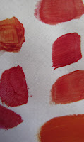
I had a hard time believing that yellow and magenta mixed together would make red. But seeing is believing! Here are some swatches I made by mixing different amounts of yellow and magenta paints. There are warmer reds with more yellow and cooler reds with more magenta. For the most part, though, these colours look like red to me.
All the colour watches I have painted and posted here are made using exclusively cyan, magenta, and yellow paints. The blues you see in my colour wheels here are made by mixing only magenta and cyan.
The New Colour Wheel
We've established that cyan, magenta, and yellow are primary colours, and when you mix two primary colours you get secondary colours: red, blue, and green. But what about orange? And more importantly, what about purple? It turns out these two are tertiary colours, those transitions between primary and secondary colours.
So to make purple, we have to mix 3 parts magenta with one part cyan. You can play with this formula to create many different purples, as illustrated by my swatches here. Notice that none of them are muddy or grey. That's because I'm actually using primary, not secondary colours.
The problem with mixing red and blue is that you're actually mixing all the primaries together.
Red = magenta + yellow
Blue = magenta + cyan
Red + Blue = magenta + cyan + yellow
This makes for a muddy mix.
Most of the colours we encounter in daily life are not quite so bright as the swatches I've painted here. So where on the colour wheel do they fit? More on that next time.


